Herrera HeadHunters, 2025
Landing Page Design: Herrera HeadHunters
UX/UI design, Content Strategy, UI motion design

Role
Digital Designer
Timeline
1 month
Team
2 members
Tools
Figma
Herrera HeadHunters: More Than a Traditional Recruitment Agency
Herrera HeadHunters is a Portugal-based international recruitment agency that utilizes its patented CoreAlign AI approach to streamline remote global hiring through faster placements and improved cultural fit.

How to Establish Conversion-Ready Credibility Through One User-Centered Landing Page?
The objective was to redesign the existing landing page into a high-conversion touchpoint that communicates a patented AI recruitment methodology while directly addressing employer pain points.
Research Findings: Understanding Employers and Market Gaps
To build a user-centered foundation, I conducted the following research activities:
Stakeholder Interviews: Analyzed business objectives and market-specific value propositions to align design with global goals.
Content Audit: Evaluated existing materials to eliminate redundancies and improve navigational clarity.
User Personas: Created detailed profiles representing key employer segments to tailor the user experience.
Primary & Secondary Research: Identified critical pain point such as low transparency and poor candidate fit to inform a targeted content strategy.
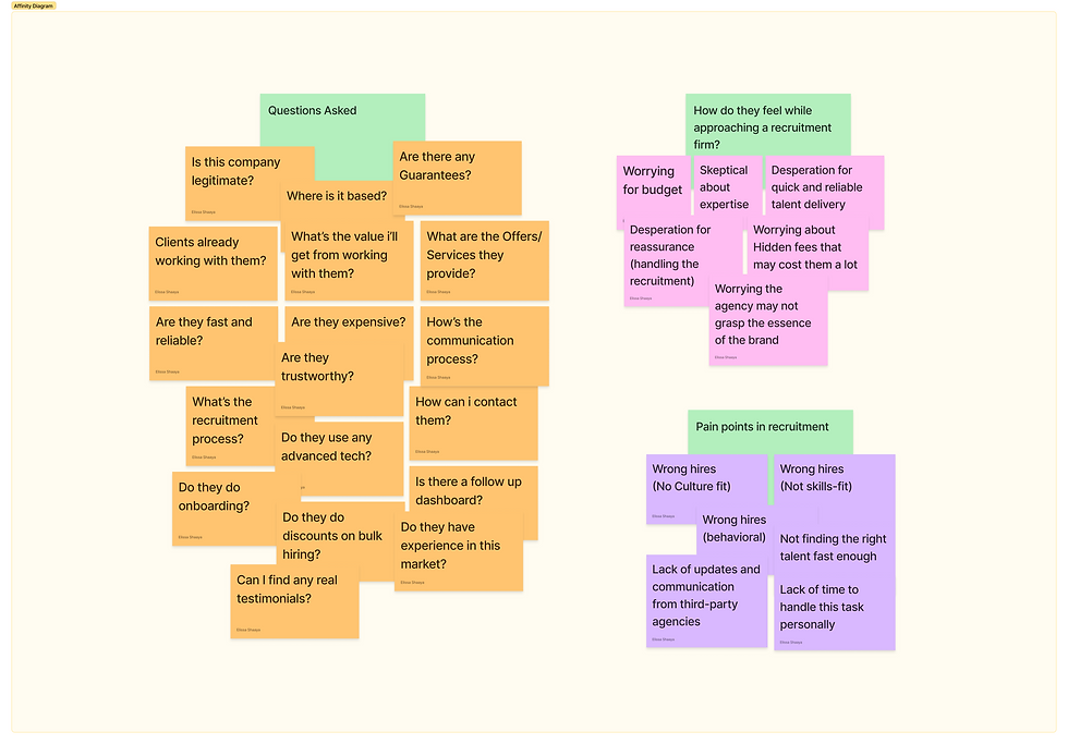
All pain points and concerns, answered.
Strategic UX Redesign
Narrative-Led UX: Structured the landing page as a persuasive sequence to build credibility and drive action.
Cognitive Optimization: Placed sections strategically to reduce friction and align with user intent.
Progressive Flow: Captured attention via social proof before introducing methodology, value metrics, and guarantees.
Trust Building: Integrated success stories and risk-reversal guarantees to address high-investment industry concerns.
Dynamic Engagement: Used alternating layouts and scroll-based storytelling to maintain user interest.
Contextual Conversion: Embedded seamless CTA paths throughout the journey to capture high-intent leads.

User-Centered Landing Page Structure for Recruitment Conversion
Aesthetic Evolution: Transitioned to a clean, elevated, and modern look by replacing solid colors with refined UI elements.
Visual Techniques: Integrated frosted glass effects, soft shadows, and subtle gradients for a sophisticated digital feel.
Dynamic Motion: Implemented scroll-based animations and smooth transitions to enhance user engagement and flow.
Brand Refinement: Modernized the "Bounty Hunters" concept by replacing traditional vector icons with a custom 3D avatar.
Visual Narrative: Shifted the "hunting" metaphor toward a contemporary, tech-forward aesthetic that resonates with premium employers.


Engineering Trust Through Narrative UX
Quote requests
+28%
Bounce rate
-18%
Scroll depth
72% vs 45% pre-redesign
Avg Session duration
02:15 min vs 00:35 min
Conversion Surge: Achieved a 28% increase in quote requests within the first month post-launch.
Engagement Growth: Average session duration soared from 35 seconds to 2:15 minutes (+285%).
User Retention: Bounce rates dropped 18% while average scroll depth improved from 45% to 72%.
Strategic Impact: Proven that sequenced storytelling builds higher B2B credibility than aesthetics alone.
Clarity Optimization: Front-loading the proprietary methodology reduced initial bounce rates by 40%.
Objection Handling: Positioning guarantees directly after pain points reduced exit rates by 22%.
Focused Interaction: Scroll-triggered animations boosted case study completion rates by 35%.